Custom UI Guide - Compose Component
This guide provides an example of how to customize the UI components of the MineSec Headless SDK using Jetpack Compose. The example demonstrates how to override the default UI components provided by the SDK.
🧑🏽💻
You can find the example code for UI provider here via github (opens in a new tab)
Customizable UI
| Component | Description |
|---|---|
AmountDisplay | Customizes how the amount and description are displayed. |
AwaitCardIndicator | Customizes the await card main UI (animation) shown while waiting for the card. |
AcceptanceMarkDisplay | Customizes the display of supported payment methods and wallet visibility. |
UiStateDisplay | Customizes the display of various UI states. |
ProgressIndicator | Customizes the progress indicator display. |
Walkthrough
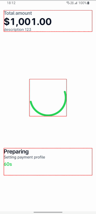
Below is a complete example showing how to customize various UI components such as AmountDisplay, AcceptanceMarkDisplay, AwaitCardIndicator, ProgressIndicator, and UiStateDisplay.
- Create a new class that extends
HeadlessActivity. - Override the
provideUimethod to return a customUiProvider. - Define the custom
UiProviderby overriding the necessary composable functions.
The example would look:
Code Example
In this example, we just override the default composable by wrapping it with a red border (modifier = Modifier.border(1.dp, Color.Red))
class ClientHeadlessImpl : HeadlessActivity() {
  override fun provideUi(): UiProvider = ClientUiProvider
}

object ClientUiProvider : UiProvider() {
  @Composable
  override fun AmountDisplay(amount: Amount, description: String?) {
    Box(
      modifier = Modifier.border(1.dp, Color.Red),
      contentAlignment = Alignment.Center
    ) {
      super.AmountDisplay(amount, description)
    }
  }

  @Composable
  override fun AcceptanceMarkDisplay(supportedPayments: List<PaymentMethod>, showWallet: Boolean) {
    Box(
      modifier = Modifier.border(1.dp, Color.Red),
      contentAlignment = Alignment.Center
    ) {
      super.AcceptanceMarkDisplay(supportedPayments, true)
    }
  }

  @Composable
  override fun AwaitCardIndicator() {
    Box(
      modifier = Modifier
        .fillMaxSize()
        .border(1.dp, Color.Red),
    ) {
      super.AwaitCardIndicator()
    }
  }

  @Composable
  override fun ProgressIndicator() {
    Box(
      modifier = Modifier.border(1.dp, Color.Red),
      contentAlignment = Alignment.Center
    ) {
      super.ProgressIndicator()
    }
  }

  @Composable
  override fun UiStateDisplay(modifier: Modifier, uiState: UiState, countdownSec: Int) {
    Box(
      modifier = Modifier.border(1.dp, Color.Red),
      contentAlignment = Alignment.Center
    ) {
      super.UiStateDisplay(modifier, uiState, countdownSec)
    }
  }
}