Custom UI Guide - XML
This guide provides an example of how to customize the UI components of the MineSec Headless SDK using XML view. The example below would demonstrate how to override the default UI components provided by the SDK.
You can find the example compose project here via github (opens in a new tab)
Customizable UI
| Component | Description |
|---|---|
AmountDisplay | Customizes how the amount and description are displayed. |
AwaitCardIndicator | Customizes the await card main UI (animation) shown while waiting for the card. |
AcceptanceMarkDisplay | Customizes the display of supported payment methods and wallet visibility. |
UiStateDisplay | Customizes the display of various UI states. |
ProgressIndicator | Customizes the progress indicator display. |
Walkthrough
Below is a complete example showing how to customize various UI components such as AmountView, AwaitCardIndicatorView, AcceptanceMarksView, and ProgressIndicatorView.
- Create a new class that extends
HeadlessActivity. - Create a custom
ViewProviderfor xml layout with data binding. - Wire up the
ViewProviderin the custom headless implementation using theUiProvider.
The example would look:
Custom Headless Activity implementation
First we'll need to extend the base HeadlessActivity
class CustomHeadlessImpl : HeadlessActivity()Custom view provider
To use the view inflated from xml, let's create a holder class for that.
Import the interfaces from the SDK, extends the holder with it.
import com.theminesec.sdk.headless.ui.*

private class CustomViewProvider :
    AmountView,
    ProgressIndicatorView,
    AwaitCardIndicatorView,
    AcceptanceMarksView,
    SignatureScreenView
We'll override the view provider method later, but first we can update the CustomHeadlessImpl to provide the view first:
class CustomHeadlessImpl : HeadlessActivity() {
    override fun provideUi() = CustomViewProvider().run {
        UiProvider(
            amountView = this,
            progressIndicatorView = this,
            awaitCardIndicatorView = this,
            acceptanceMarksView = this,
        )
    }
}
Component view interfaces
The SDK exposes the customizable UI component via the below interfaces, you can extend the corresponding component you wish to provide.
interface AmountView {
    fun createAmountView(context: Context, amount: Amount, description: String? = null): View
}

interface AwaitCardIndicatorView {
    fun createAwaitCardIndicatorView(context: Context): View
}

interface AcceptanceMarksView {
    fun createAcceptanceMarksView(context: Context, supportedPayments: List<PaymentMethod>, showWallet: Boolean = true): View
}

interface ProgressIndicatorView {
    fun createProgressIndicatorView(context: Context): View
}
Create view programmatically
You can directly create the View programmatically in the overridden method
private class CustomViewProvider :
AmountView
//...
{
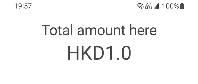
// amount component with view created programmatically
override fun createAmountView(context: Context, amount: Amount, description: String?) =
// create the linear layout with the context passed in
LinearLayout(context).apply {
orientation = LinearLayout.VERTICAL
layoutParams = LayoutParams(LayoutParams.MATCH_PARENT, LayoutParams.WRAP_CONTENT)
// create and add 2 textview for the label and the amount value display
addView(TextView(context).apply {
textSize = 30F
textAlignment = TEXT_ALIGNMENT_CENTER
text = "Total amount here"
})
addView(TextView(context).apply {
textSize = 40F
textAlignment = TEXT_ALIGNMENT_CENTER
text = "${amount.currency.currencyCode}${amount.value}"
})
}
}This will render the view like below:
Inflate view with XML layout
Alternatively, you can inflate the xml layout and then use it in the view provider.
With the data binding feature enabled, the xml layout will be auto generated the Binding class. Ensure it is enabled in the build.gradle.kts file:
android {
    ...
    dataBinding {
        enable = true
    }
}
Example xml layout
<?xml version="1.0" encoding="utf-8"?>
<layout xmlns:android="http://schemas.android.com/apk/res/android"
xmlns:tools="http://schemas.android.com/tools"
xmlns:app="http://schemas.android.com/apk/res-auto"
>
<data>
<variable
name="amount"
type="String"
/>
<variable
name="description"
type="String"
/>
</data>
<androidx.constraintlayout.widget.ConstraintLayout
android:layout_width="match_parent"
android:layout_height="match_parent"
>
<TextView
android:id="@+id/tvTotal"
android:layout_width="match_parent"
android:layout_height="wrap_content"
android:textSize="20sp"
app:layout_constraintTop_toTopOf="parent"
android:textAlignment="center"
android:text="Total amount"
/>
<TextView
android:id="@+id/tvAmt"
app:layout_constraintTop_toBottomOf="@id/tvTotal"
android:layout_width="match_parent"
android:layout_height="wrap_content"
android:textAlignment="center"
android:textSize="40sp"
android:text="@{amount.toString()}"
tools:text="$20.00"
/>
<TextView
android:id="@+id/tvDesc"
app:layout_constraintTop_toBottomOf="@id/tvAmt"
android:layout_width="match_parent"
android:textAlignment="center"
android:layout_height="wrap_content"
android:textSize="20sp"
android:text="@{description}"
tools:text="Description"
/>
</androidx.constraintlayout.widget.ConstraintLayout>
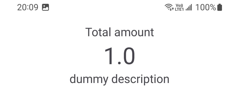
</layout>From the view provider, we can now use the generated CompAmountDisplayBinding with the layout inflater:
private class CustomViewProvider :
    AmountView
    //...
{
    // amount component with view inflated from xml layout
    override fun createAmountView(context: Context, amount: Amount, description: String?): View {
        val inflater = LayoutInflater.from(context)
        // note the `CompAmountDisplayBinding` is auto generated as the xml layout is wrapped with the `<layout>` tag
        return DataBindingUtil.inflate<CompAmountDisplayBinding>(inflater, R.layout.comp_amount_display, null, false)
            .apply {
                root.layoutParams = ConstraintLayout.LayoutParams(
                    ConstraintLayout.LayoutParams.MATCH_PARENT,
                    ConstraintLayout.LayoutParams.MATCH_PARENT
                )
                // bind the amount and description to the XML's corresponding `data.variable` tag
                this.amount = amount.value.toString()
                this.description = "dummy description"
            }
            .root
    }
}
This will render the view like below:
Example await card animation
The below example shows how to use a TextureView with a demo_await.mp4 in the /res/raw directory.
//..
override fun createAwaitCardIndicatorView(context: Context): View {
    val mediaPlayer = MediaPlayer()
    return TextureView(context).apply {
        surfaceTextureListener = object : TextureView.SurfaceTextureListener {
            override fun onSurfaceTextureAvailable(surface: SurfaceTexture, width: Int, height: Int) {
                val videoUri = Uri.Builder()
                    .scheme(ContentResolver.SCHEME_ANDROID_RESOURCE)
                    .authority(context.packageName)
                    .appendPath("${R.raw.demo_await}")
                    .build()

                mediaPlayer.apply {
                    setDataSource(context, videoUri)
                    setSurface(Surface(surface))
                    isLooping = true
                    prepareAsync()
                    setOnPreparedListener { start() }
                }
            }

            override fun onSurfaceTextureSizeChanged(surface: SurfaceTexture, width: Int, height: Int) {}
            override fun onSurfaceTextureDestroyed(surface: SurfaceTexture): Boolean = true
            override fun onSurfaceTextureUpdated(surface: SurfaceTexture) {}
        }
    }
}
Example acceptance marks
When the app is awaiting the card tapping, you could customize the AwaitCardIndicatorView for the acceptance marks display.
- From the method argument, you can get the
supportedPaymentsassociated with the profile. - From the SDK, there is a helper extension to get the image resource from both payment method and wallet type -
getImageRes()fromPaymentMethodandWalletType.

import com.theminesec.sdk.headless.ui.component.resource.getImageRes

//..
override fun createAcceptanceMarksView(context: Context, supportedPayments: List<PaymentMethod>, showWallet: Boolean): View {
    return LinearLayout(context).apply {
        orientation = LinearLayout.HORIZONTAL

        val iconLp = LayoutParams(
            LayoutParams.WRAP_CONTENT,
            LayoutParams.WRAP_CONTENT,
        ).apply {
            marginEnd = 16.intToDp(context)
        }

        supportedPayments.forEach { pm ->
            addView(ImageView(context).apply {
                setImageResource(pm.getImageRes()).apply {
                    layoutParams = iconLp
                }
            })
        }
        if (showWallet) {
            addView(ImageView(context).apply {
                setImageResource(WalletType.APPLE_PAY.getImageRes())
            })
        }
    }
}
Example progress indicator
import com.google.android.material.progressindicator.CircularProgressIndicator

//..
override fun createProgressIndicatorView(context: Context): View {
    // the circular progress from material library
    return CircularProgressIndicator(context).apply {
        layoutParams = LayoutParams(
            LayoutParams.MATCH_PARENT,
            LayoutParams.MATCH_PARENT
        )
        indicatorSize = 200.intToDp(context)
        trackThickness = 8.intToDp(context)
        isIndeterminate = true
        trackColor = Color.TRANSPARENT
        setIndicatorColor(Color.parseColor("#FFD503"))
        isVisible = true
    }
    // or you can also use a custom animation mp4 from the res/ raw
    //val mediaPlayer = MediaPlayer()
    //return TextureView(context).apply {
    //    surfaceTextureListener = object : TextureView.SurfaceTextureListener {
    //        override fun onSurfaceTextureAvailable(surface: SurfaceTexture, width: Int, height: Int) {
    //            val videoUri = Uri.Builder()
    //                .scheme(ContentResolver.SCHEME_ANDROID_RESOURCE)
    //                .authority(context.packageName)
    //                .appendPath("${R.raw.demo_processing}")
    //                .build()
    //            mediaPlayer.apply {
    //                setDataSource(context, videoUri)
    //                setSurface(Surface(surface))
    //                isLooping = true
    //                prepareAsync()
    //                setOnPreparedListener { start() }
    //            }
    //        }
    //        override fun onSurfaceTextureSizeChanged(surface: SurfaceTexture, width: Int, height: Int) {}
    //        override fun onSurfaceTextureDestroyed(surface: SurfaceTexture): Boolean = true
    //        override fun onSurfaceTextureUpdated(surface: SurfaceTexture) {}
    //    }
    //}
}